Grades 9-12

Don't have an account yet? Sign up for free
Don't have an account yet? Sign up for free
Nearpod version available
Students will be able to:

In this personal finance lesson, students will understand how graphs can be misleading through real GDP.
Mobile devices, tablets or computers with internet access and, if possible, screen recording capability, one per group
Becoming a good consumer of information means being able to determine whether graphs are misleading. To do so, students must learn the components of a graph and how to tell whether they as readers are being manipulated to serve a specific point of view. Just like vital signs determine the health of a person, data about a country can show its health. Specifically, a country’s material standard of living is directly proportional to its real Gross Domestic Product per capita. In other words, if a country has a high real GDP per capita, it also has a high standard of living.
33. Review the key points of the lesson using the following questions:
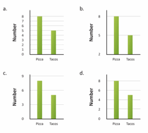
Multiple Choice

| Country | Infant Mortality Rate (per 1,000 live births) | Population (in millions) | Real GDP (in millions of U.S. Dollars) | Life Expectancy |
| Australia | 4 | 22.3 | 922,870 | 82 |
| Finland | 3 | 5.4 | 390,407 | 80 |
| Germany | 3 | 81.8 | 3,204,596 | 81 |
| Japan | 2 | 126.5 | 4,383,325 | 83 |
(NOTE: Data from FRED, 2011)

[Answer B.]
Constructed Response
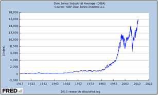
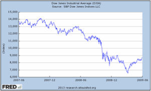
The Dow Jones Industrial Average is considered by some to be a vital sign of the health of the U.S. stock markets. Below are two tables showing the Dow Jones Industrial Average. Compare and contrast the two graphs. If a person only saw Graph 2, what might they assume about the Dow Jones Industrial Average? Explain.
Graph 1:

Graph 2:

Sample answer: the two graphs are similar because they show the Dow Jones Industrial Average (DJIA) over a period of time, they both use index as the unit on the Y-axis, and they both have the same title. The graphs are different because they have different origins on each axis, cover a different time period, and have different increments on each scale. Graph 2 primarily shows a decline in the Dow Jones Industrial Average. Given the limited number of years shown (2007 to 2009) one might assume that the DJIA only decreases over time.

Grades 9-12

Grades 9-12

Grades 9-12

Grades 9-12
