
 Sign in with Google
 Objective
Students will be able to:
- Explain why more productive workers usually earn more income.
- Identify at least one government policy that might influence the distribution of income.
- Analyze the impact of a government intervention in a market on the distribution of income.
- Compare measures of central tendency to analyze the distribution of income.
- Construct a Lorenz curve using an online interactive.
- Calculate the Gini coefficient to analyze income inequality.

In this personal finance lesson, students will learn how productivity and government policy influences the distribution of income.
Resources
- Activity 1– Simulation Income Cards, one copy cut apart
- Activity 2– Simulation Tax and Transfer Cards, one copy cut apart
- Activity 3– Data Recording Sheet, one copy per student
- Distribution of Income PowerPoint Presentation | pdf File
- Mix of coins (pennies, nickels, dimes, and quarters)
- https://web2.0calc.com/ (optional)
- Interactive: technology.councilforeconed.org/income-distribution/
- Mathematics Glossary
Procedure
The personal distribution of income is the way analysts organize income by categories such as households, families, or even individuals. The level of income usually depends on the productivity of workers and other factors that affect the structure of the economy, such as government policies, technology, or discrimination. Differences in productivity across individuals can contribute to income inequality.
Mathematics and statistics provide tools to analyze the distribution of income and income inequality. The mean and median provide measures of central tendency for the distribution of income. The Lorenz curve graphically represents the distribution of income across a population. While the mean and median condense information about the income distribution to single summary statistics, the Lorenz curve provides more perspective about the distribution of income. Comparisons between different income distributions can be made by analyzing differences in statistics, such as the mean and median, and the Lorenz curve. For example, comparing the mean and median income of people in an economy is common. Using median income can avoid some of the pitfalls of averages.
Changes in productivity and structural factors like government policies can alter the distribution of income. Government often uses policies to redistribute income to reduce income inequality. Government taxation is one means of redistributing income. Progressive income taxes, for example, redistribute income in favor of lower income households. Redistribution of income can also occur through a transfer of income, spending and assistance programs, and programs designed to provide training to workers. A goal of reducing income inequality might involve transferring money from higher-income groups to lower-income groups. While some redistribution policies may increase income for some groups, some of these policies, at the same time, may distort economic incentives by weakening the relationship between productivity and income. Other policies could have different effects.
Mathematics and statistics also provide ways to effectively analyze the level of income equality and changes in the distribution of income. Changes in the distribution of income can be reflected in changes in measures of central tendency, such as the mean and median, as well as changes in a Lorenz curve. Income inequality can be measured by comparing measures of central tendency and by calculating a Gini coefficient based on a Lorenz curve. The degree of income inequality is quantified by a Gini coefficient, and changes in the value of the Gini coefficient indicate changes in income inequality.
- Display Slide 1. For the Jumping Jack Cash challenge, instruct students to do as many jumping jacks as they can in ten seconds. They must keep track of how many jumping jacks completed. Tell students to begin when you are ready and have them stop after ten seconds. Ask students to report their results.
- Tell students you will give them one cent for each jumping jack they completed. Distribute the coins according to how many jumping jacks they “produced” so that the person with the most jumping jacks gets the most coins and the person with the least jumping jacks gets the least coins. Point out that the coins are their income.
- Display Slide 2. Define productivity as the amount of output produced per unit of input used per unit of time. Point out that the productivity of each student in this activity is the number of jumping jacks they completed per second. It is calculated by dividing the total number of jumping jacks a student completes by the total time of 10 seconds.
- Explain that income is earned by households for selling or renting their productive resources. Types of income may include salaries, wages, interest, rent, and profit. The productive resources in this activity are the students who earned income for the jumping jacks they completed.
- Explain that, within the class, income varied according to productivity. Those with lower productivity earned less income while those with higher productivity earned more income. Productivity can be influenced by education, experience, talents, and other factors. Increasing an individual’s level of education, for example, often increases his or her productivity. As productivity increases, income usually increases. Point out that income from labor is usually based on worker’s productivity and amount of time worked. Higher levels of productivity usually lead to greater economic benefits for employers, so they want to hire productive workers. Employers, therefore, are willing to pay higher incomes to more productive workers.
- Discuss the following:
- How might students increase their jumping jack productivity? [Answers will vary, but students may say that practicing, working out, using more effort, learning better techniques, etc. would increase their productivity.]
- What would they expect to happen to their income if their productivity increased? [Income should increase because they can produce more jumping jacks in ten seconds.]
- Explain that students will engage in a simulation about the distribution of income. Distribute one card from Activity 1 to each student. Point out that each card includes information on income, education, and occupation. Make sure you give out a total number of cards that is divisible by five (you want evenly sized groups to form quintiles). If you have extra students, pair them to represent households. This demonstrates that households are of different sizes. Instruct the students to line up in order from least to greatest based on the income shown on their card.
- Instruct the students to break into five equal groups based on income. One group might be those with an income of 0 to 100, the next group from 101 to 200. Once in the groups, have them take a seat. Explain that these five groups are income quintiles. This means that each quintile represents 20 percent of the households in the classroom.
- Project the online Distribution of Income Interactive (http://technology.councilforeconed.org/income-distribution/ ). Instruct students to access the interactive on their computers. Have each “household” share its income (which is on the cards) with the class. As they share enter the incomes, beginning with the lowest income and moving to the highest income, into the Household Incomes boxes on the online Distribution of Income Interactive. Point out on the interactive that the total income shown at the top is the sum of all the households’ incomes.
- Instruct the members of each quintile to calculate their quintile’s total income. Use that number to determine what percent of total income their quintile represents. As groups share their findings, enter the results in the Quintile Share of Total Income boxes at the top of the Distribution of Income Interactive. Instruct students to enter the information in the boxes on their interactive. Distribute a copy of Activity 3 to each student. Have them record the Quintile Share of Total Income and Cumulative Share of Total Income in Table 1.
- View the graph on the Distribution of Income Interactive created by the data entered. The curve generated on the graph is called the Lorenz curve. A point on the curve represents the cumulative percentage of total income held by the associated cumulative percentages of households. Tell the students that in this case each quintile’s percent of income is added to the previous quintiles’ percent of income.
- Ask students what value their quintile is on the curve in comparison to the percent they calculated. [They should explain that the value of the curve is the value they calculated plus the value of each quintile lower than theirs.] The cumulative share of total income for each quintile is automatically calculated and shown near the top of the Distribution of Income Interactive.
- Introduce the concept of distribution of income as the way analysts organize income by categories such as households. Explain that income inequality is the unequal distribution of an economy’s total income among individuals, families, or households.
- Discuss the following:
- How would you describe the income distribution derived from the income scenarios in Activity 1? [Answers will vary, but students may say that incomes vary widely among households.]
- Why do you think incomes vary so much? [Answers will vary, but students should connect to the jumping jack activity recognizing the positive relationship between productivity and income.]
- What factors contribute to differences in productivity across households? [Answers will vary, but students should connect to differences in education and experience.]
- Would you suggest changing the distribution of income? [Answers will vary, but students may say that they think income is too unequal, that lower-income individuals need more income, or that it should not change.]
- Continue the simulation. Explain that the government wants to reduce income inequality by redistributing income. Redistribution of income often is a transfer of income through government taxation, spending, assistance programs, education and training programs, and other types of programs targeted at particular income groups. The goal might be to transfer money from higher-income groups to lower-income groups. Sometimes increasing the income that low-income and moderate-income households earn does not come at the expense of high-income households. One example of this might be greater educational achievement among low-income and moderate-income households. Similarly, programs designed to provide training for less productive or unemployed workers can increase income for these workers. Also, the minimum wage is likely to increase the wages and income of many low-wage workers; however, sometimes the minimum wage can reduce entry-level opportunities. If this is the case, then some workers may have significantly higher income while others may face less income than might have occurred without a higher minimum wage.
- Explain that to simulate a government policy to redistribute income, some students will face an income tax and some students will receive an income transfer. Distribute a tax card from Activity 2 to each student in quintiles 4 and 5. Distribute a transfer card from Activity 2 to each student in quintiles 1 and 2. Instruct students who received a tax card to subtract the amount of the tax and the students who received a transfer card to add the amount of transfer to their original incomes. Tell them to line up again in order from least to greatest income.
- Instruct students to break into quintiles and repeat procedure steps 8-10. To enter the new household income data, click on the Graph Another Set of Household Incomes button in the Distribution of Income Interactive. The previous Lorenz curve will continue to be shown, allowing for easy comparison of “before taxes and transfers” and “after taxes and transfers.” Note how the income distribution changed before and after the redistribution policy. (Clicking on the Clear and Reset button deletes any previously entered data. To remove any undesired Lorenz curves shown, double-click on the curve.) Have students record the new Quintile Share of Total Income and Cumulative Share of Total Income data in Table 2 of Activity 3.
- Ask students to observe the new Lorenz curve and the information in the Tables on Activity 3. Discuss the following:
- How does this policy affect the shape of the Lorenz curve? [The curve will become less convex, or less “bowed.”]
- What were the results of the government policies on income distribution? [The government policy reduced income inequality. Higher-income households now have a lower percentage of income while lower-income households now have a higher percentage of income.]
- For higher income quintiles, how might this policy affect their willingness to work? [Higher-income households may have less income, which could reduce their incentive to be as productive as before the policy. The policy could weaken the relationship between productivity and income.]
- For low-income quintiles, how might this policy affect their willingness to work? How might this government policy affect the relationship between productivity and income? [Lower-income households will have relatively more income, which under certain circumstances could reduce their incentive to increase their productivity. In some situations, a policy could weaken the relationship between productivity and income.]
- Display Slide 3. Temporary Assistance for Needy Families (TANF). TANF is an example of a government policy to assist the needy and it has the effect of redistributing income. It is the primary welfare program for families with children in the United States. Using the slide, discuss key features of TANF.
- Discuss the following:
- Why do you think the government created welfare programs targeting poor families in the 1930s? [During the Great Depression, many families lost jobs, which significantly reduced their incomes. The government wanted to improve economic conditions of families by supplementing their incomes.]
- What is the impact of welfare programs, like TANF, on the distribution of income and income inequality? [These programs tend to redistribute income and reduce income inequality.]
- The United States has made significant changes to its welfare program for poor families, including limiting financial assistance to five years and requiring some type of work activity for recipients. The Earned Income Tax Credit was created to provide income supplements to working families earning low incomes. Why do you think these changes were made? [Answers may vary, but students may say to provide incentives that encourage people to work.]
- Continue the simulation. Now ask the students to consider a government policy that might attempt to eliminate income inequality by requiring everyone to have the same income. Pick up everyone’s activity cards. Explain that everyone’s income will be equal to the total income divided by the number of students/households. Tell households to line up again in order from lowest to highest income. Help students recognize that there is no difference in their order because everyone has equal income. Instruct the students to regroup into quintiles based on their new income. Once in quintiles, have them take a seat.
- Have each household share what its new income is with the class. Click on the Graph Another Set of Household Incomes button in the Distribution of Income Interactive. Enter each household’s income, which are the same, in the Household Incomes boxes in the Distribution of Income Interactive and ask students to enter the data in their interactive.
- Instruct students in each quintile to calculate their quintile’s new percentage of total income. As students share their findings, enter their results in the Quintile Share of Total Income boxes in the Distribution of Income Interactive and have the students do the same on their interactive. Ask what every quintile’s percent of total income is. [20 percent of the total income.]
- To check for understanding, ask the students the following questions:
- Has the total earned income for the classroom changed? (No, although in the real world it would likely change if incentives to work are diminished.)
- What is each household’s income? [It is the total income divided by the number of students; all students have the same income.]
- What is the percent of income for each quintile? [20 percent of total income.]
- Direct student’s attention to the new Lorenz curve. How does the policy that created equal income for all households affect the shape of the Lorenz curve? [The curve will become a straight 45 degree line from the origin; refer to the Lorenz curve shown in the online Distribution of Income Interactive.]
- How does this policy affect the relationship between productivity and income? [There is now no relationship between productivity and income. Differences in productivity do not cause differences in income. Income is only determined by the policy and no other factors.]
- What are pros and cons of this income-equality policy? [Answers will vary. Students may say pros include increasing income for otherwise lower-income households, and this effect is greater the larger the proportion of the population that has low incomes. Students may say cons include the policy seems unfair, households do not receive income based on their productivity, or the incentives to increase productivity or perform as productively as before are eliminated.]
- Display Slide 4. Point out how similar the Lorenz curves are to those produced by Activity 1 and Activity 2 of the simulation. Explain that a measure of central tendency is a single value that exemplifies the center of a data set. Specific measures of central tendency include mean and median. Mean is a measure of center in a set of numerical data, computed by adding a set of values and dividing by the number of values in the set. Median is a measure of center in a set of numerical data that appears at the center of a sorted version of the list—or the mean of the two central values. Measures of central tendency can be used to analyze income distribution.
- Display Slide 5. Ask students to find the mean of the income data from Activity 1 in the simulation. (The data are shown on the slide.) Once students have shared their answers, click to reveal the correct answer. [After adding all numbers and dividing by 25, the mean should be $205.60.] Point out that the mean income indicates the average income received by an individual, family, or household in the population.
- Display Slide 6. Ask students to find the median of the same data from Activity 1 in the simulation. (The data are shown on the slide.) Once students have shared their answers, click three times to reveal how to determine the median and then click again to show the correct answer. [After sorting all numbers in order, the middle number is $105.] Point out that the median income indicates that half of the population receives an income higher than the median and half of the population receives an income lower than the median. The median can be a more accurate indicator of the central tendency of a distribution because the mean can be distorted by outlying values. Notice the difference between the mean of $206.50 and the median of $105. The mean is distorted by the few individuals earning the highest incomes.
- How are the mean and median affected by income inequality? [The income inequality is different between the two curves and the more unequal curve has lower measures of central tendency.]
- Is the median a better measure of central tendency than the mean in this example? [Yes.] Why? [The median is a better measure because outliers can distort the mean.]
- Display Slide 7. Explain that, to more thoroughly analyze income inequality, the area under the Lorenz curve is used. This can be done by approximating the area using estimated rectangular and triangular areas. These are already given on the slide. If desired as an optional exercise, explore how to estimate the area under a Lorenz curve. To estimate the area under the Lorenz curve, add the area of each trapezoid under the Lorenz curve that is defined by each quintile. The formula for calculating the area of a trapezoid is ½(a+b)*h, where a is the length of the “top” side of the trapezoid, b is the length of the “bottom” side of the trapezoid, and h is the height of the trapezoid. In the case of the Lorenz curve, h is 0.2 because each trapezoid under the curve represents each quintile. The length of side a is the cumulative percent of income for a given cumulative percent of households (i.e., the sixtieth percentile), and the length of side b is the cumulative percent of income for the next lowest cumulative percent of households (i.e., the fortieth percentile).
- Still displaying Slide 7, define a Gini coefficient as a statistical measure of the inequality of a distribution. It is a ratio comparing the bounded area under the line of equality and the Lorenz curve (A) to the total area under the line of equality (A+B). Therefore, the Gini coefficient is A/(A+B) which quantifies the degree of inequality. Gini coefficients are represented as a decimal between 0 and 1. Demonstrate how to calculate the Gini coefficient through the following steps:
- For the red Lorenz curve shown on the left side of Slide 7, area B is given as 0.236 (or 23.6%). The area could be estimated by finding the areas of the trapezoids that make up this total area.
- Area A bounded by the line of equality and the Lorenz curve has an area of 0.264 (or 26.4%), which is found by subtracting area B from the area under the line of equality that is always equal to 0.5 (or 50%).
- The Gini coefficient is calculated as A/(A+B) = 0.264 / (0.264+0.236) = 0.528. Click once to reveal the correct answer on Slide 7.
- Ask students to calculate the Gini coefficient for the blue Lorenz curve on the right side of Slide 7. Click the slide again to reveal the correct answer. [The Gini coefficient is 0.304, equal to 0.152 / (0.152+0.348).]
- Ask the students the following questions and discuss their answers:
- How is the value of the Gini coefficient related to income inequality? [A Gini coefficient closer to 0 represents greater income equality. A Gini coefficient closer to 1 represents greater income inequality.]
- Considering mean, median, and Gini coefficient, which is a superior way to analyze income inequality? [Students should be able to connect that income inequality is better analyzed with a Gini coefficient and the distribution of income is better analyzed with the median rather than the mean.]
- Display Slide 8. Explain that the graph shows the Gini Coefficient for U.S. families from 1947 to 2014. Discuss the Gini coefficient for the United States.
- Ask students:
- What was the Gini coefficient in 2014? [The Gini coefficient was 0.452.]
- What does that indicate about the degree of income inequality? [It indicates moderate-income inequality; it is in the middle of the range for a Gini coefficient.]
- When was the Gini coefficient at its lowest? [In 1968 when it was 0.348.]
- Review the goal of this lesson, which was to learn what influences the distribution of income and to apply mathematics and statistics to analyze the distribution of income.
- To check for overall understanding, ask students the following questions:
- Why do more productive workers usually earn more income? [Income from labor is frequently based on a worker’s productivity and amount of time worked. Higher levels of productivity usually lead to greater economic benefits for employers. Employers, therefore, are willing to pay higher incomes to more productive workers.]
- How could a government policy influence the distribution of income?
[Answers may vary. One likely answer may be that government policy could redistribute income from those with higher incomes to those with lower incomes, reducing income inequality but likely weakening the relationship between productivity and income.] - What is an example of a government policy that redistributes income? [Answers may vary, but examples could include Temporary Assistance for Needy Families, earned Income Tax Credits, or a minimum wage change.]
- What are two measures of central tendency used to analyze the distribution of income? [Mean and median.]
- What measure is used to analyze the degree of inequality in the distribution of income? [Gini coefficient.]
- How do you calculate the Gini coefficient to measure the degree of income inequality? [The Gini coefficient is calculated as the ratio of the area between the line of equality and the Lorenz curve to the area under the line of equality.]
Assessment
- Who would likely earn the most income?
- Bob, who did not graduate from high school and works part-time at a fast-food restaurant
- Jo, who just graduated from high school and started working at her first full-time job two months ago
- Nick, who has a bachelor’s degree and is working on a master’s degree part-time while working as an entry-level manager at a small company
- [Sarah, who just started working at a law firm after graduating from law school]
- What would likely be the effect of a government policy that increased income equality by taxing the fifth quintile to transfer income to the first quintile?
- Incomes in the first and fifth quintiles are less than before the policy.
- Incomes in the first and fifth quintiles are more than before the policy.
- Incomes in the first quintile are less and incomes in the fifth quintile are more than before the policy.
- [Incomes in the first quintile are more and incomes in the fifth quintile are less than before the policy.]
- Calculate the mean income for the following four people.
|
Sharon |
Michael |
Jordan |
Allison |
|
$20,000 |
$35,000 |
$60,000 |
$85,000 |
- $47,500
- [$50,000]
- $52,500
- $200,000
Short Answer:
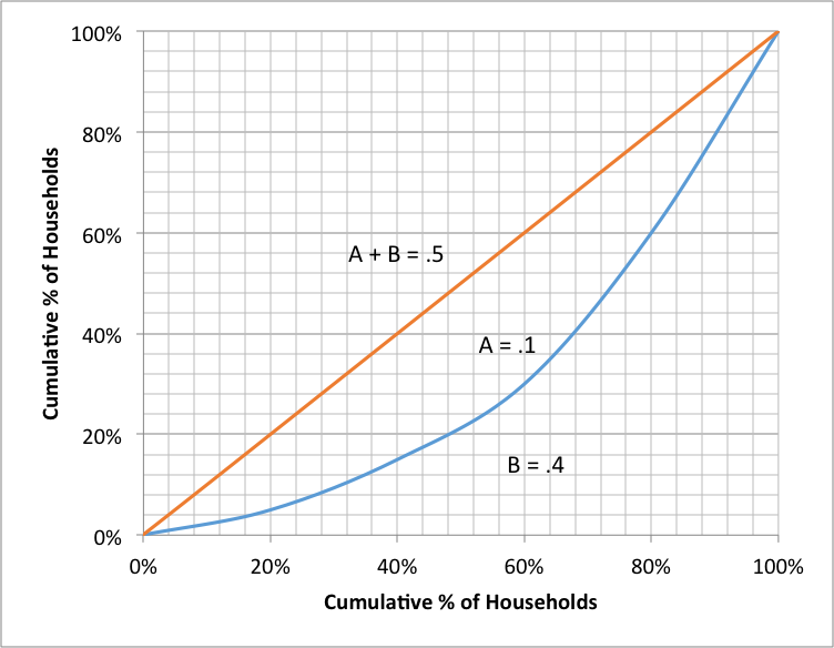
The Lorenz curves for two different income distributions are shown in the following graphs:
Graph 1
Graph 2
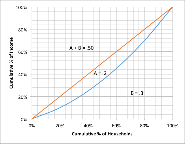
- Analyzing the shape of the Lorenz curve, explain which distribution you think exhibits less income inequality. [Graph 2 exhibits less income inequality than graph 1 because its Lorenz curve is less convex or “bowed.”]
- Using data from each graph, calculate the Gini coefficient for each income distribution. [Graph 1 curve has a Gini coefficient of 0.4 and graph 2 curve has a Gini coefficient of 0.2.]
- What does the Gini coefficients from each graph, tell you about the distribution of income inequality? [Graph 1 Gini coefficient of 0.4 represents more income inequality. The most unequal income would be represented by a Gini coefficient equal to 1. Graph 2 Gini coefficient of 0.2 represents less income inequality. The most equal income distribution would be represented by a Gini coefficient equal to 0.]
- Create a government policy to redistribute income that could explain the difference between the two income distributions shown in graphs 1 and 2 and briefly summarize your policy. [Answers will vary, but students may say that their policy redistributes income by transferring income through government taxation and tax credits, spending, or assistance programs to target particular income groups with the goal of transferring income from higher-income groups to lower-income groups. Alternative programs might include increased job training and education.]