
Grades 9-12

Don't have an account yet? Sign up for free
Don't have an account yet? Sign up for free


Students view a video on inflation and are introduced to the concept of unemployment. They then utilize Excel to create scatterplots, regression line equations, and correlation coefficients (r) for inflation and unemployment data from the 1980s, 1990s, and the 2000s. Students compare the results from the different time periods to determine the type of relationship and the strength of the correlations. This lesson is suitable for Algebra II, Pre-Calculus, or Statistics as an application of regression and correlation.
60 minutes
Students will be able to:
Beginning with the work of A.W. Phillips in the late 1950s, economists have debated a potential causal relationship between inflation and unemployment. In this lesson students have the opportunity to work with real data and discover what, if any, short term relationship exists within a decade and compare the regression and correlation (r) between different decades. Students will evaluate the relationship between inflation and unemployment for a short run time period.
1. Display Slide 2. Introduce the lesson by asking the following:
a. What are the prices of some goods and services you have purchased recently? [Answers will vary.]
b. What are you paid for work you do? [Answers will vary.]
c. What do you know about prices your parents paid for goods and services when they were younger? [Answers will vary.]
d. What do you know about what your parents were paid for work they did when they were your age? [Answers will vary.]
2. Display Slide 3. Introduce and define inflation – A sustained rise in the general price level for all the goods and services produced in an economy.
3. Distribute Activity 1, and give students a moment to review the questions. Explain they will fill in the blanks as they watch the video.
4. Show inflation video from Virtual Economics at https://www.econedlink.org/resources/inflation-video-and-quiz/
5. Review the answers to the close activity using answer key for Activity 1.
6. Ask students to complete the quiz provided with the video. Review the answers.
7. Display Slide 4. Introduce and define unemployment as the number of people 16 years old and older who are without jobs and are actively seeking work.
8. Display Slide 5. To check for understanding, ask:
a. David is a 29-year-old male. He does not work. He plays video games 8 hours a day and lives in the basement of his parent’s home. He has not filled out a job application in 6 months. Is David counted as unemployed? [No, he is not actively searching for work.]
b. Martha is 34 and is a stay-at-home mom. She does not work for pay outside the home. Is Martha counted as unemployed? [No, she is not actively searching for work or working for pay.]
c. Jennifer is a 19-year-old female and works part time at the pizza parlor. Is Jennifer counted as unemployed? [No, she is employed.]
d. Walter is a 45-year-old male and is not working. He has submitted his resume to two firms this week. Is Walter counted as unemployed? [Yes, he is not working and is actively searching for work. ]
e. Ask the students to provide additional examples of those counted and not counted as unemployed. [Answers of those excluded – stay at home moms/dads not looking for work, those under age 16, and retirees. Answers for those included will vary – working or actively searching for work, interviewing, applying for jobs, etc. ]
9. Display Slide 6. Review the definitions of Positive and Negative (Inverse) Relationships – Explain that if there is a positive relationship between variables, when one variable changes, the other moves in the same direction. Explain that if there is a negative (inverse) relationship between two variables, when one variable changes, the other variable moves in the opposite direction.
10. Display Slide 7. Utilize the Phillips curve graph found at https://ourworldindata.org/grapher/phillips-curves-in-the-us?time=1960..1969, to explain the relationship between unemployment and inflation in the 1960s. The Phillips curve is an economic theory that inflation and unemployment have a stable and inverse relationship. Developed by William Phillips, it claims that with economic growth comes inflation, which in turn should lead to more jobs and less unemployment.
11. Display Slide 8 and discuss the following.
a. What do you notice about the graph in years 1964 through 1969? [For this short time span, as inflation is increasing, unemployment is decreasing. There is a short-term negative relationship between the two variables].
b. What kind of relationship is depicted by the Phillips curve for 1964 through 1969? [Negative relationship.]
c. What is meant by a negative relationship? [As one variable increases, the other variable decreases. In the case of a Phillips curve, as unemployment increases, inflation decreases, and vice versa, as unemployment decreases, inflation increases.]
12. Explain that some argued that the relationship found in the Phillips curve was causal; that is, by allowing a little more inflation, policy makers could reduce unemployment. Tell students that today they will investigate data from several decades to determine whether there is a correlation between the two variables for those decades and to determine if the Phillips curve is causal.
13. Review prior knowledge on Correlation (r) found in a regression analysis. Explain that correlation (r) represents the relationship between two variables. The value of correlation (r) can only be between 1 and -1, strong correlations are closer to 1 or -1, while weak correlations are closer to 0.
14. Distribute a copy of Activity 2 to each student.
15. Display Slide 10. Using the unemployment and inflation (CPI) data provided for the 1980s in Activity 2, instruct students to follow along as you work through how to create a scatterplot in Excel and calculate the regression line equation and correlation coefficient for the relationship between the two variables.
a. Open Excel (Instructions listed are for Excel 2010.)
b. Enter data into excel as shown below:
| Date |
Unemployment Rate |
Inflation Rate |
|
1980 |
7.2 |
13.5 |
|
1981 |
7.6 |
10.4 |
|
1982 |
9.7 |
6.2 |
|
1983 |
9.6 |
3.2 |
|
1984 |
7.5 |
4.4 |
|
1985 |
7.2 |
3.5 |
|
1986 |
7.0 |
1.9 |
|
1987 |
6.2 |
3.6 |
|
1988 |
5.5 |
4.1 |
|
1989 |
5.3 |
4.8 |
c. Display Slide 11. To produce a scatter plot select the area containing unemployment and inflation.
d. Click on insert.
e. Choose scatter, hover to show then select option for Scatter with only Markers.
f. Click on chart.
g. Under chart tools, go to layout, select Chart Title, then select Above Chart and change label from “Unemployment” to “1980s.”
h. Then click on Axis Title, select Primary Horizontal Axis Title, then Title Below Axis rename title to “Inflation.”
i. Then click on Axis Title, select Primary Vertical Axis Title, then Rotated Title and rename title to “Unemployment.”
j. To find the regression line and its equation, click on chart, go to layout, choose Trend lines, scroll down to more trend line options, choose linear, automatic, and display equation on chart, hit close.
k. Select and move equation to side.
l. To find the correlation (r), click on Data, then Data Analysis, scroll down and select Regression. Hit OK.
m. Click into the input Y range box, then go back to spreadsheet and select the Change in CPI (Inflation) data column of information.
n. Click into the input X range box, then go back to the spreadsheet and select the Unemployment data column of information.
o. Hit OK and review summary data, multiple R is your correlation coefficient (r)
p. Display Slide 12. Point out to students that their graph should look like the one on Slide 12. See below.
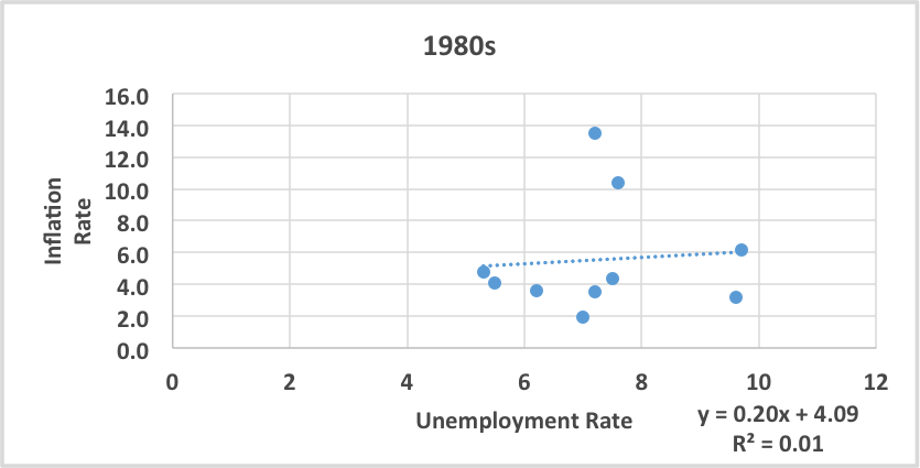
| Multiple R | 0.08 | |
| R Square | 0.01 | |
| Adjusted R Square | -0.12 | |
| Standard Error | 1.57 | |
| Observations | 10 |
16. Upon completion ask the students:
a. What type of relationship exists in this decade? [Positive relationship.]
b. Is this a strong, medium or weak correlation? [Weak correlation because (r) value is .08]
17. Display Slide 13 and distribute a copy of Activity 3 to each student. Instruct students to create a scatter plot using these data. Allow time for them to create scatter plot, regression line equation, and correlation coefficient (r) as done with the 1980s data as a class group.
18. Display Slide 14. Point out that their completed graph should resemble the graph on Slide 14. See below:
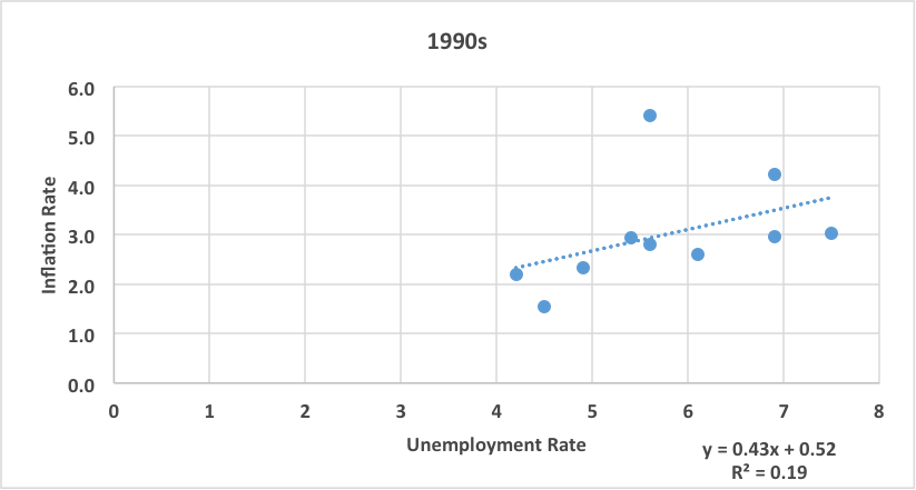
1990s Data Analysis
SUMMARY OUTPUT
Regression Statistics
| Multiple R | 0.43 | |
| R Square | 0.19 | |
| Adjusted R Square | 0.08 | |
| Standard Error | 1.04 | |
| Observations | 10 |
19. Upon completion ask the students:
a. What type of relationship exists for the decade? [Positive relationship.]
b. Is this a strong, medium or weak correlation? [Medium because (r) value is .43]
20. Display Slide 15. Compare data and results of both graphs.
a. For which decade, 80s or 90s, do the data show the stronger correlation between inflation and unemployment? How do you know? [1990s had the stronger correlation because the r value in the 80s was .08 and the r value for the 90s was .43 and .43 is closer to 1. When r = 1, 1 is the highest numerical value for r and it represents the strongest positive correlation between two variables.]
b. How do the graphs differ? [In the 1980s the data points are more spread out, while in the 1990s the data points really line up very nicely.]
c. In the 1980s graph, pick an outlier and explain how it affects the correlation coefficient. [The data from 1981, it made the correlation weaker because it is far from the regression line.]
21. Display Slide 16 and provide each group/pair of students a copy of Activity 4. Allow time for them to create scatter plot, regression line equation, and correlation coefficient (r) for the 2000s data, just as done with the 1980s and 1990s data.
22. Display Slide 17. Point out that their graph should resemble the graph on the slide.
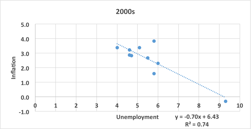
Regression StatisticsMultiple R-0.86
R Square0.74
Adjusted R Square0.71
Standard Error0.79
Observations10
23. Upon completion ask the students:
a. What type of relationship exists for the decade? [Negative relationship.]
b. Is this a strong, medium or weak correlation? [Strong correlation (r) value is -.86)]
c. Is this different from what we observed in the 80s and 90s data? [Yes, because in the other decades we observe a positive relationship.]
1. According to the Phillips curve hypothesis expressed in the 1960’s, the correlation between the unemployment rate and inflation rate is:
a. positive
b. [negative]
c. doesn’t exist
d. cannot be determined
2. A correlation r value of .85, means that the relationship between two variables is:
a. [positive and strong]
b. negative and strong
c. positive and weak
d. negative and weak
Constructed Response:
Do relationships between two variables always stay the same?
[No, not always. Relationships can change over time.]
If we selected different time spans, such as 1985 to 1995 or 2000 to 2007, would the results of the regression vary and why? If we selected historical time periods (Great Depression, WWII, Invention of Personal Computer, etc.), would the results of regression vary and why?
[Using different data would likely result in a different relationship because inflation and unemployment rates are different in all years. Using historical time periods would likely result in highly varied relationships due to the unusual factors of the era. We have shown the relationship over time is inconsistent. It is likely that other things are changing as well.]
1. Review the key points in the lesson with the following questions.
a. What is inflation? [A sustained rise in the general level of prices.]
b. What is unemployment? [The number of people 16 and older who are not working, who want to work, and are actively looking for work.]
c. What is the Phillips curve and what does it hypothesize about the relationship between the rate of unemployment and the rate of inflation? [Hypothesis is a negative relationship, as one increases the other decreases.]
d. Has the Phillips curve hypothesis held during different time periods? [No, our analysis of the data show it did not hold through the 1980s and 1990s.]
e. How did regression analysis help you to evaluate the Phillips curve hypothesis? (By using the regression line equation you can determine the positive and negative relationship between the variables during different time periods.)
f. Explain the different strengths of the correlations among the decades. [The 2000s data showed the strongest correlation between inflation and unemployment with a correlation coefficient (r) = -.86. The weakest correlation between inflation and unemployment was in the 80s with a correlation coefficient (r) = .08.]
g. Remind students that correlation does not mean causation. Although unemployment and inflation are correlated, a change in one does not cause a change in the other.

Grades 9-12
Grades 9-12
Grades 9-12

Grades 3-5
